posted
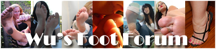
I've decided to change my signature box. More specifically, my banner. Just wanted 2 emphasize on the whole, Mikayla Theme! In doing so, I actually created two new designs. Nevertheless, I'm still undecided on which one I want to use: http://i489.photobucket.com/albums/rr252/Weekend_Warrior/new_banner2.jpg
posted
just my opinion, but i think the text on the banner is a bit overbearing as opposed to the pictures of the girls.
Posts: 4 | Registered: Oct 2009
| IP: Logged |
quote:Originally posted by armpitgirls: just my opinion, but i think the text on the banner is a bit overbearing as opposed to the pictures of the girls.
I agree. You can barely tell it's about feet, as there are no really clear shots of any showing through or around the text.
-------------------- You give pleasure to the feet, you give pleasure to the person. Posts: 1297 | Registered: Jul 2009
| IP: Logged |
posted
Mmm, I agree with the text being a little over-emphasised. Try to do something like the Wu's banner maybe (Not stylistically particularly, just with the text).
posted
I work on Photoshop a lot and I would say to create your text with a shadow backdrop and decreasing the opacity so that the text is showing some of the pictures in the background and not so overbearing.
posted
I am lovin' the feet of the girl in the "9-o'clock" position on your sig box, and the one just to the right and above that one. Awesome toes and awesome balls of the feet!
-------------------- You give pleasure to the feet, you give pleasure to the person. Posts: 1297 | Registered: Jul 2009
| IP: Logged |
-------------------- "Nina, this is my house, you work for me, and I want to suck your toes." -Big Trouble (2002) Posts: 1855 | Registered: Nov 2007
| IP: Logged |


 UBBFriend: Email this page to someone!
 Printer-friendly view of this topic


![[Roll Eyes]](rolleyes.gif) In doing so, I actually created two new designs. Nevertheless, I'm still undecided on which one I want to use:
In doing so, I actually created two new designs. Nevertheless, I'm still undecided on which one I want to use:


![[Smile]](smile.gif)

![[Thumbs Up]](graemlins/thumbsup.gif) This will help me a great deal with my decision.
This will help me a great deal with my decision.![[Big Grin]](biggrin.gif) If you're referring to my "new" banner, they're all the same woman...Mikayla Miles
If you're referring to my "new" banner, they're all the same woman...Mikayla Miles ![[Drool]](graemlins/drool.gif)
![[Laugh]](graemlins/laugh.gif) Thanks again for all the feedback, fellas!
Thanks again for all the feedback, fellas!


